I originally thought, I would go up in front of the class and talk about my thought process for this assignment but due to nerves, I will have to explain everything on my blog.
Brief: To design a website that will persuade a set target audience to visit my island, in a four weeks, time span..
About the Island: It's an isolated island, governments from all over the world, will send their worst criminals there. The people delivered to the island, are sedated and checked to prevent them from attempting to escape, they are then dropped from a passing plane with an automatic parachute for save landing.
The only land the island is closed to is Cannes in France, officers will be stationed around the coast, to keep their eyes open for any makeshifts rafts full of people or a person, and would be ordered to shoot on sight if they do.
Mood Boards:

None of the pictures are mine.
This was my first mood, right at the beginning so I had absolutely no idea what I was doing, this was really a half attempt of trying to think of something and kick start my brain. I had no clear vision of what I wanted to do, so I tried to get any images related to island.
Since the website is designed to persuade governments from all around the world, I started looking for a much darker tone in terms of the colour scheme and a more mature vibe, so I'll be taken seriously.
For the text, I was looking for a more mysteriously and darker vibe, away from my using 'Impact' obsession, I wasn't looking for anything cheery, I found that it would be extremely off putting considering what the website is about.

My second mood board was my brain finally working, I remembered that I should remind myself of the purpose of the website while looking at several design for home pages and since I couldn't name my mood boards 1& 2, I tried to liven the names up a bit.
I than did a couple of rough layouts in my sketch book and posted online.
Layout for website, that I did in my sketchbook:
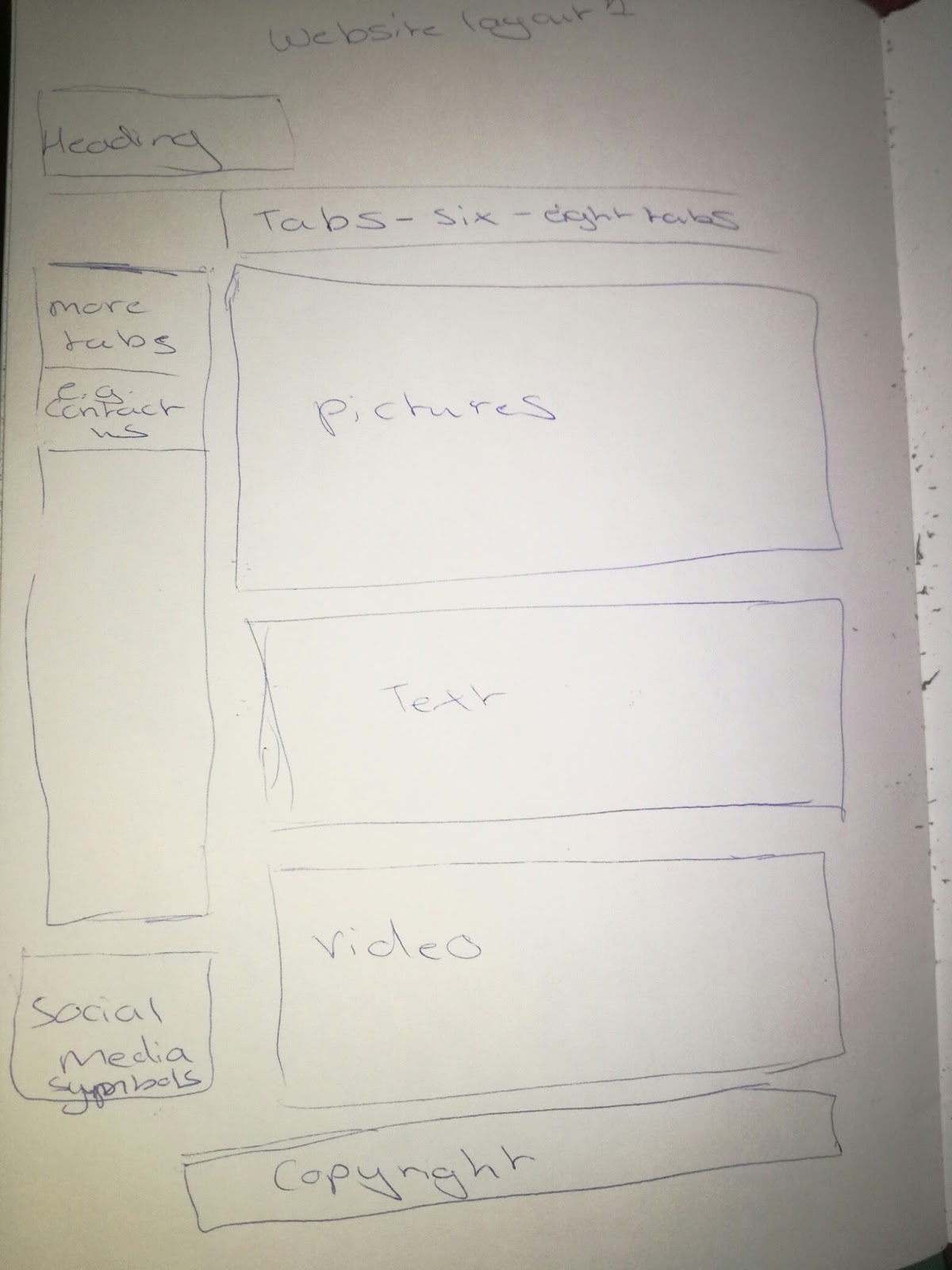

I started to think about the website as if was being viewed a mobile phone, because I know of several examples out there that had their websites in a different format depending on which system you are on, like Ebay, Amazon and YouTube.
In this, it also shows, a bit of the layout for the 'contact Us' form that I plan to do and how the website would work using touch technology.
There is also, two of my early idea's for a page layout and how the tabs will retract out, just by pressing one tab with your finger.
Than I started to think of the little things, like the play button on the video's on the website.

If this was on a video, it would roughly be like this:
I than decided to put my island flag up, for inspiration.

I created 4 colour scheme using red and black from the flag.

In the end I chose number 4.

However, I wanted my website to look mature and professional so I pulled back the hue in adobe photoshop.

I than started taking prison related things from the internet, for some reason.

I rather liked the jail cell picture so I thought about, what if this was my home page?

By this point, my half baked attempted, had become full blown idea.
I was thinking of having the large image fading in, the moment the link to website was clicked and than the text will slowly appear, it opacity 50% or so, to blend with the background.
I than had this idea to do a brain animation, using the brain on my flag, and was full prepared to go do so, but I managed to stop myself.
For one thing, a file that large can never make it onto blogger or even Sendspace, I would have to provide a link on YouTube for it work and I didn't have the time for it, so I settled on describing it on this blog.
I than went on to look at Goverment offical websites for more inspiration:
And this how it turned out.

Now you may be asking... how I went from an explosion of idea's to something so simple, as this?
Well, I realised that since this website main purpose is to appeal to governments all around the world, their not going to care how nice looking my website is.
What they would care about the most, would be the information they need to absorb and how well it's conveyed.
As long as it looks clean and polished, I had fulfilled the website purpose.
Now I'm going to explain to you, how and why the website is designed like this.
When I produced this in adobe Photoshop, I was working on a mac so I couldn't help but notice the faint scroll bar in a google Chrome, I really liked it so I added to my design.
I noticed in the Australian government, there is a picture right after the border, and I liked the idea, so I put a picture of my island underneath the border.
The 'border' is actually my chosen colour scheme, super stretched in Adobe Photoshop.
I've also noticed that in the two websites that I've viewed, they both have a search bar in their header so I thought why not add that to mine?
Website Address in the header: The website has the word 'Guest' in it's web address. This is actually from my poster for my island, the intention behind the world is a bit dark, the word 'guest' makes it sound like the island is a vacation paradise, where you check in and check out.
However on this island, prisoners check in but they never check out.
Like I said, it's a bit dark.
Why I used the font 'Impact', it's because I fell into my old habit, I love to use this font.... a lot, you'll eventually noticed once my AMV video up.
The font is bold and it immediately attracts your attention, however when you click on one of the tabs, the other fonts come into play.
Tabs: the colour of the tabs were inspired by the prison clothes from earlier, it makes the tabs stand out, the tabs are also fixed so when you scroll down, it wouldn't disappear like the rest of the page and will always be there on the page for you to see.
No comments:
Post a Comment